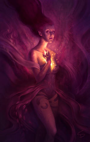
This article aims to introduce different kinds of ‘contrast’ in digital art, although most of the following points can also be applied to other media as well.
Contrast
(noun) - Contrast is a principle of art. When defining it, art experts refer to the arrangement of opposite elements (light vs. dark colors, rough vs. smooth textures, large vs. small shapes, etc.) in a piece so as to create visual interest, excitement and drama.
[source: arthistory.about.com]
1. Colours and Brightness
One of the first things to come to mind when we think of ‘contrast’ are colours contrasting with each other.
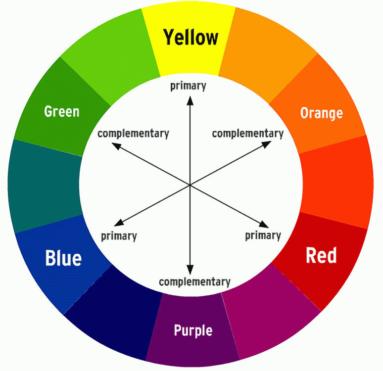
(The colours labelled as 'primary' are the primary colours in the RGB colour model. Primary colours of the CMYK colour model are cyan, magenta and yellow.)
[source: willkempartschool.com]
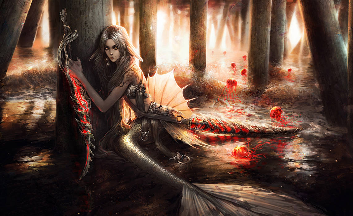
Looking at this colour-wheel we see that the colours lying opposite of each other (=complementary colours) contrast with each other, also called the complementary colour contrast.
(left: yellow-blue contrast | right: complementary red-green contrast)
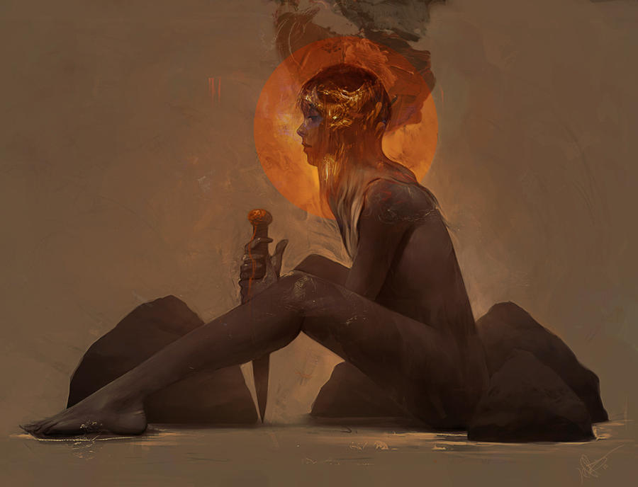
But there’s more to colour contrast than that. We can also achieve contrast through warm and cold colours, as well as bright and dim ones. The most extreme colour contrast is that between black and white (although one could argue about whether white and black are actual colours).
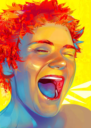
(left: warm and cold colours contrasting with each other | right: a bright red and dim blue contrasting with each other)
- If you chose a colour for some part of your artwork and are looking for one that contrasts with it, think of a colour that would hurt your eyes if it were combined with your first colour. Then tone that colour down and maybe look for a slightly different shade, until the combo isn’t a pain for your eyes anymore. It doesn’t work out for some reason? Play around with other colours and shades, and experiment!
- If you’re stuck and don't want to use complimentary colour contrast try variations of these: red-blue, blue-yellow, purple-orange, orange-green
- Postprocessing: The colour contrast in your work can be easily adjusted through levels, with Photoshop for example.
You can either adjust the whole range of RGB at once, or adjust Red, Green and Blue individually (click the deviations below for more information on how to use levels).
2. Subject, Surroundings and Focus
But there’s more! Contrast isn’t all about colours, even though that is what we associate it with the most.
There’s also the contrast between the subject and its surroundings.
If you ever had the pleasure of having to analyse a photograph in school you might remember that there are cases where the subject, let’s say, a man dressed in fine, expensive looking clothing, is in a place we might not expect him to be, e.g. he seems to be walking down a dark, dingy alley. He doesn’t seem to fit there. Or rather, he and his surroundings don’t really fit together – they are opposites. So we have another type of contrast we can use in our artworks: Our subject(s) compared to the overall setting.
If we’re looking at the contrast of subject and surroundings we should also take a look at the topic of focus. I think we can agree on the fact that having a focal point, something the eye unwittingly wanders and strays back to after having taken in the entire work, is very important.
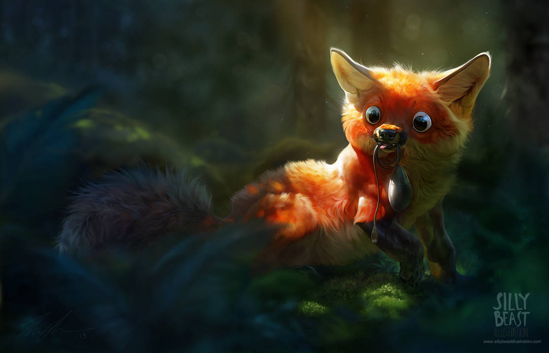
An artist can employ contrast as a tool to direct the viewer's attention to a particular point of interest within the piece, be it through a higher level of detail or sharpness, or something else.
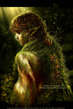
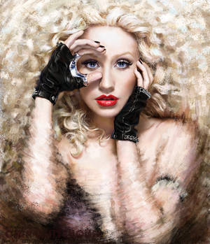
(left: extremely detailed foreground contrasts with the blurry background | right: focus on the very realistic face through the contrast between 'sharp' face and unfocused edges)
3. Art Style and Textures
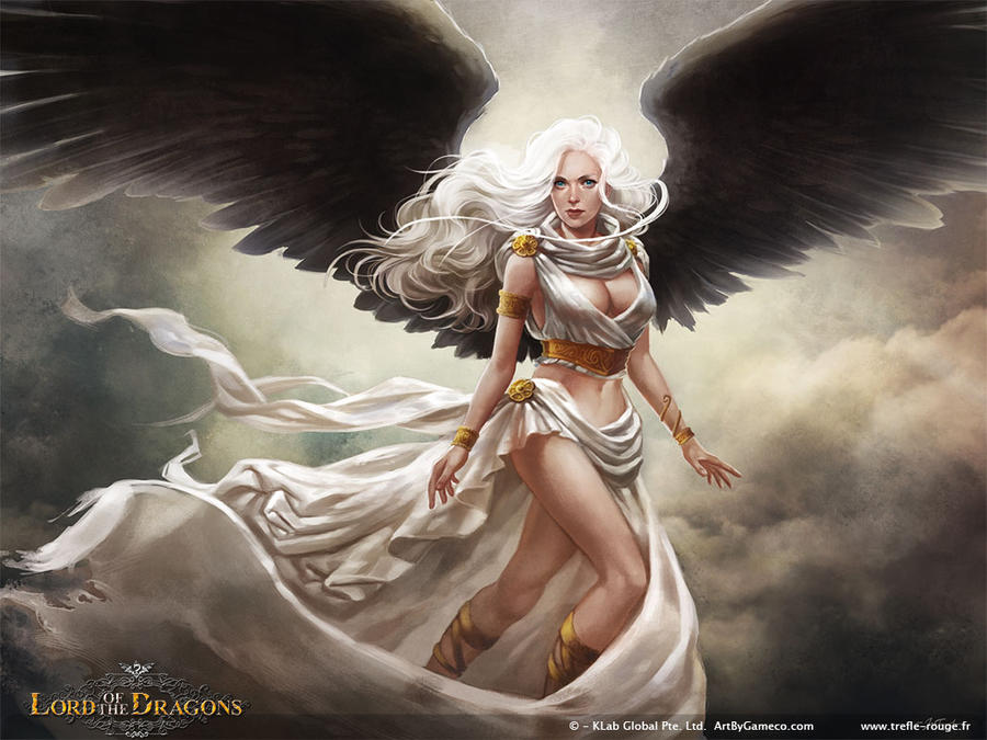
Using different art styles in your artwork, such as implementing a few art nouveau styled elements into an otherwise realistically painted work, is another way to create contrast. That works with other styles as well of course, like combining manga styled linework with a more abstract approach at colouring for example.
Last but not least, contrast can also be achieved through the use of textures. It can be as simple as putting a texture into the background to emphasise the clean outlines and shading of your work, or using different kinds of textures, like smooth and rough ones.
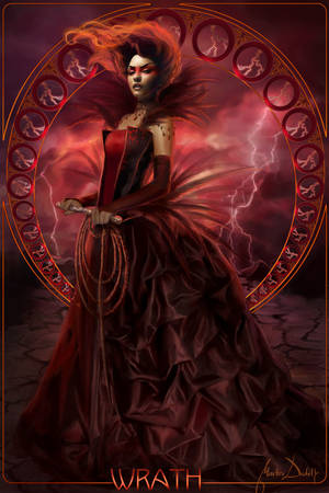
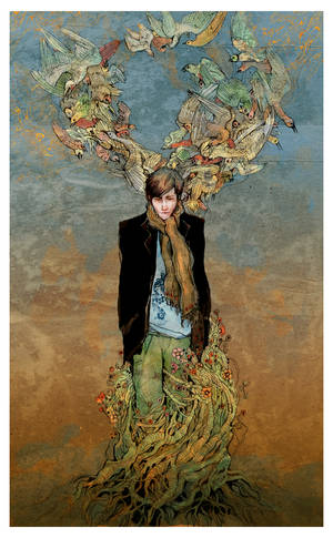
(left: mix of art nouveau elements and realistic painting techniques | right: contrast between textured background and clearly outlined foreground)
Conclusion
Contrast makes an artwork more interesting and can be used to draw the eye to certain areas. It's achieved through opposing elements of any form - colour, texture, subject, style, texture, shapes and so on. Of course you might aim for a certain mood in your work where colour contrast just doesn’t work, but you can still employ other types, such as the contrast between your main subject and its surroundings. Contrast doesn’t have to be about deliberately using clashing colours, it doesn’t have to be about colours at all, it can be as simple as emphasizing the focal point, or generally using opposites of some kind in your artwork. It doesn’t have to be extreme, and you don’t have to force contrast into your work through extremes either. And: Contrast is about opposites, but be careful not to overdo it! But like with so many things in art, experimenting is the key.
Contrast Art Feature
I hope you found this article helpful, and thanks for reading! 


